Overview
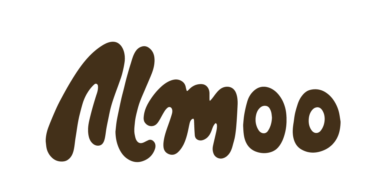
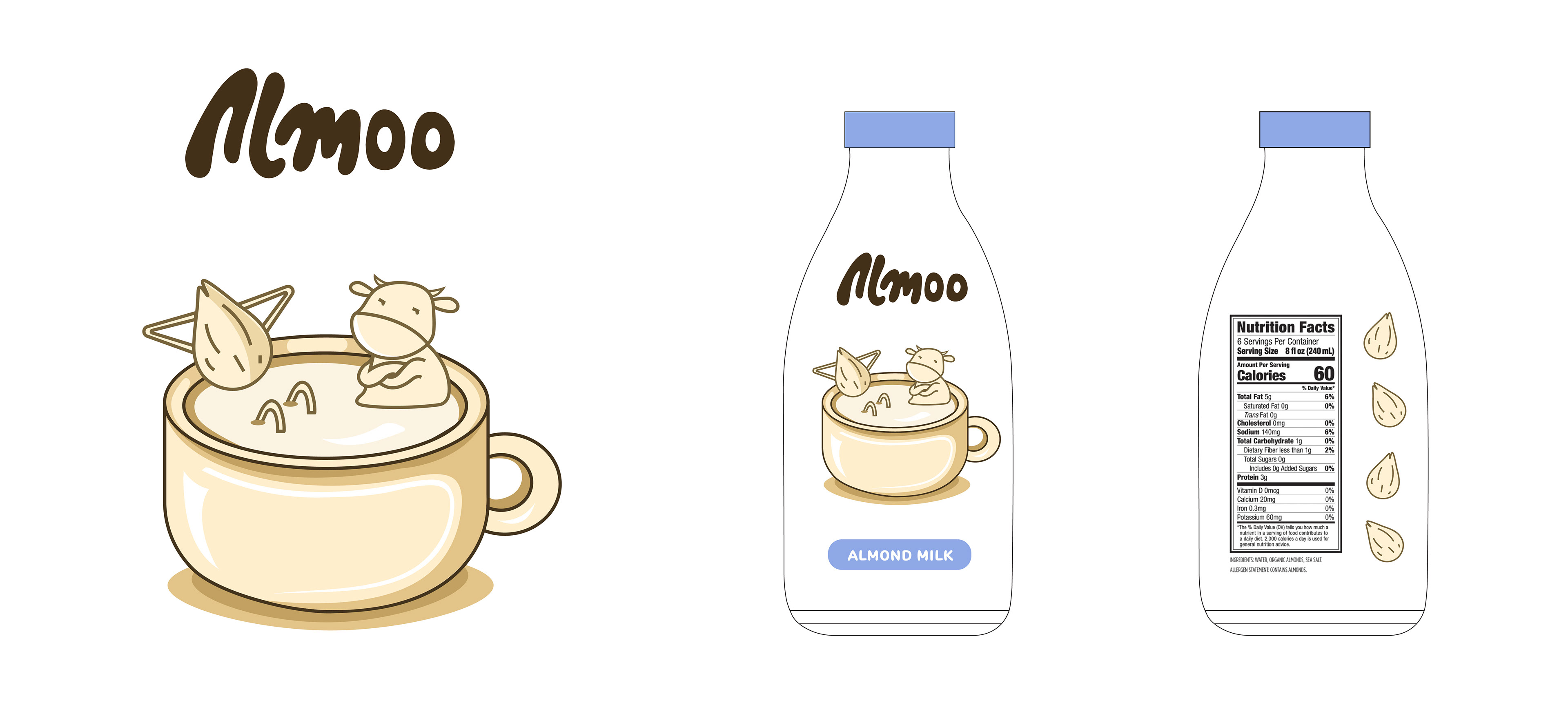
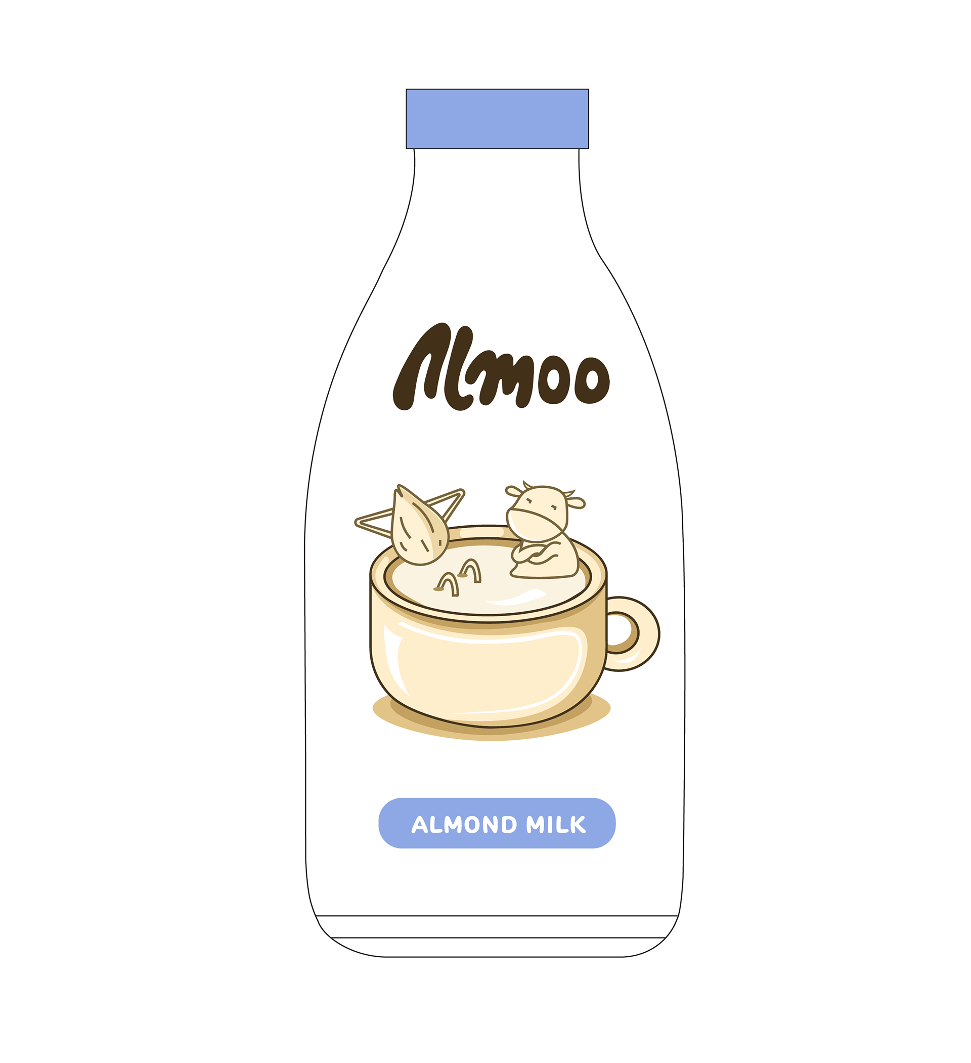
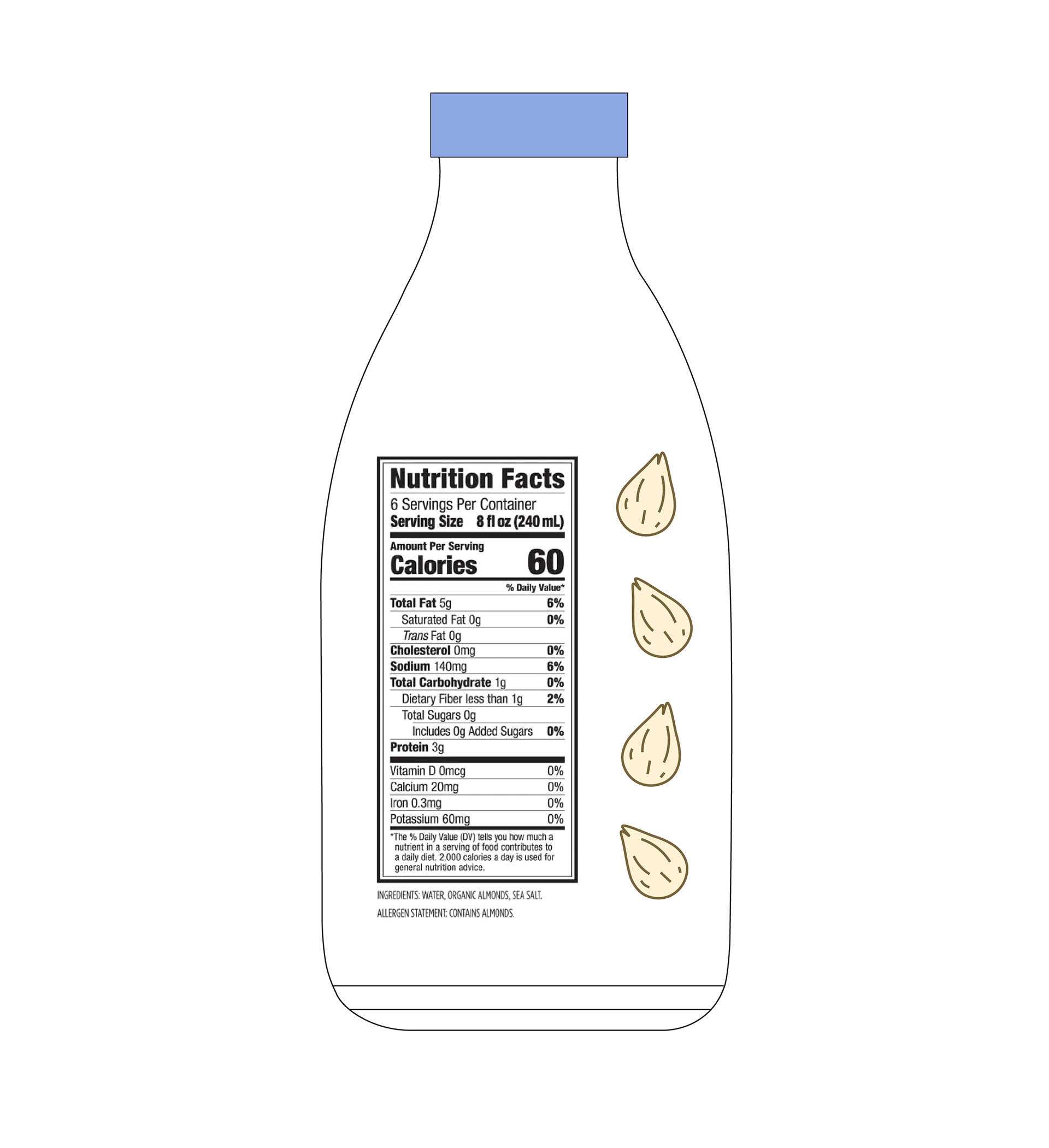
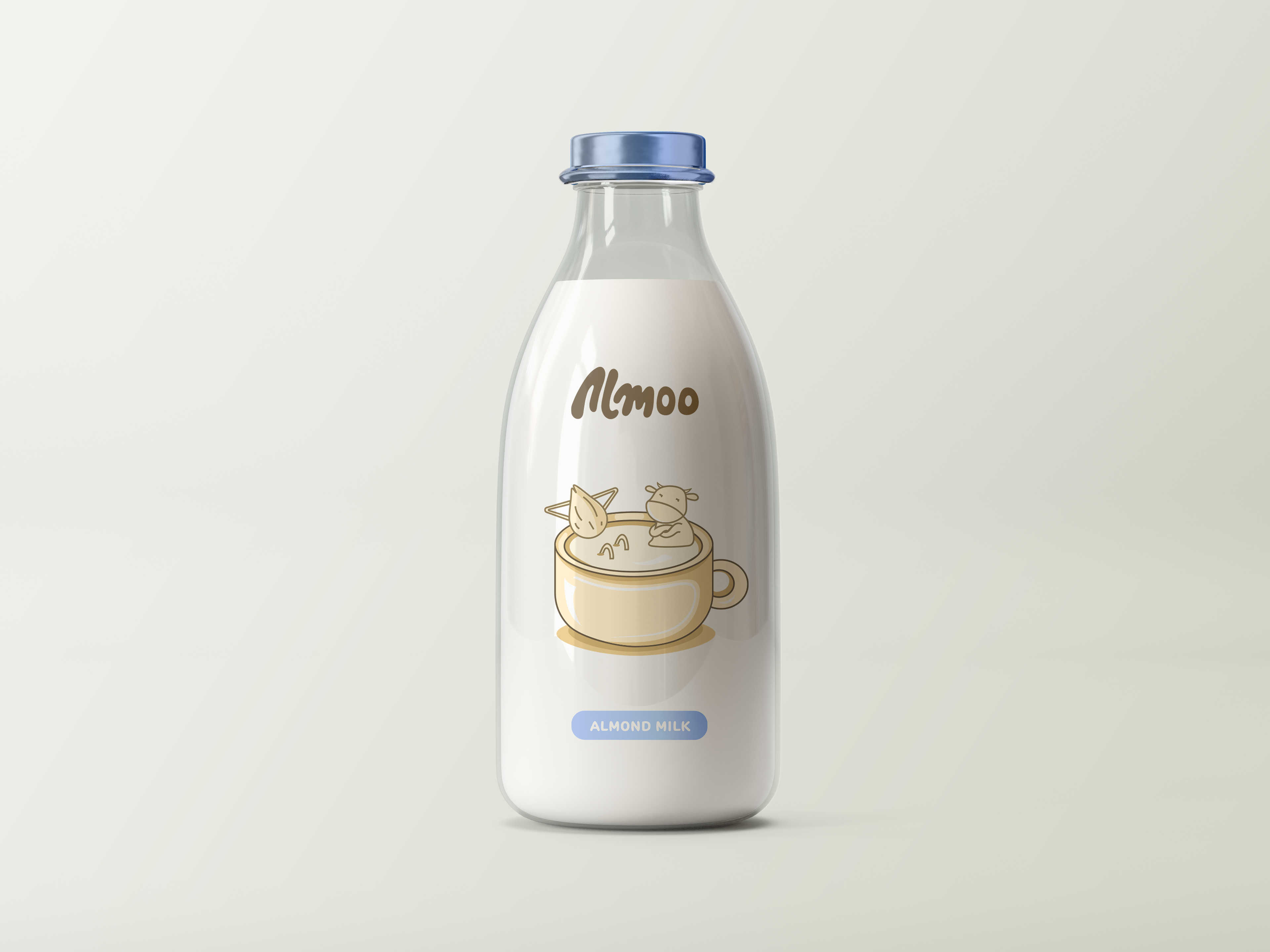
Almoo is an eco-friendly almond milk brand with reusable glass packaging, offering a sustainable alternative to plastic. The name Almoo, a mix of "Almond" and "Moo," is paired with a design featuring an almond and a cow relaxing in almond milk like a hot tub, adding a humor touch to the brand—because who says sustainability can't be fun? Almoo is here to reduce plastic waste and make a positive impact on the planet, one sip at a time. This project was a collaborative effort, with each team member contributing their unique approach to the brand, while we all brainstormed the overall concept together.
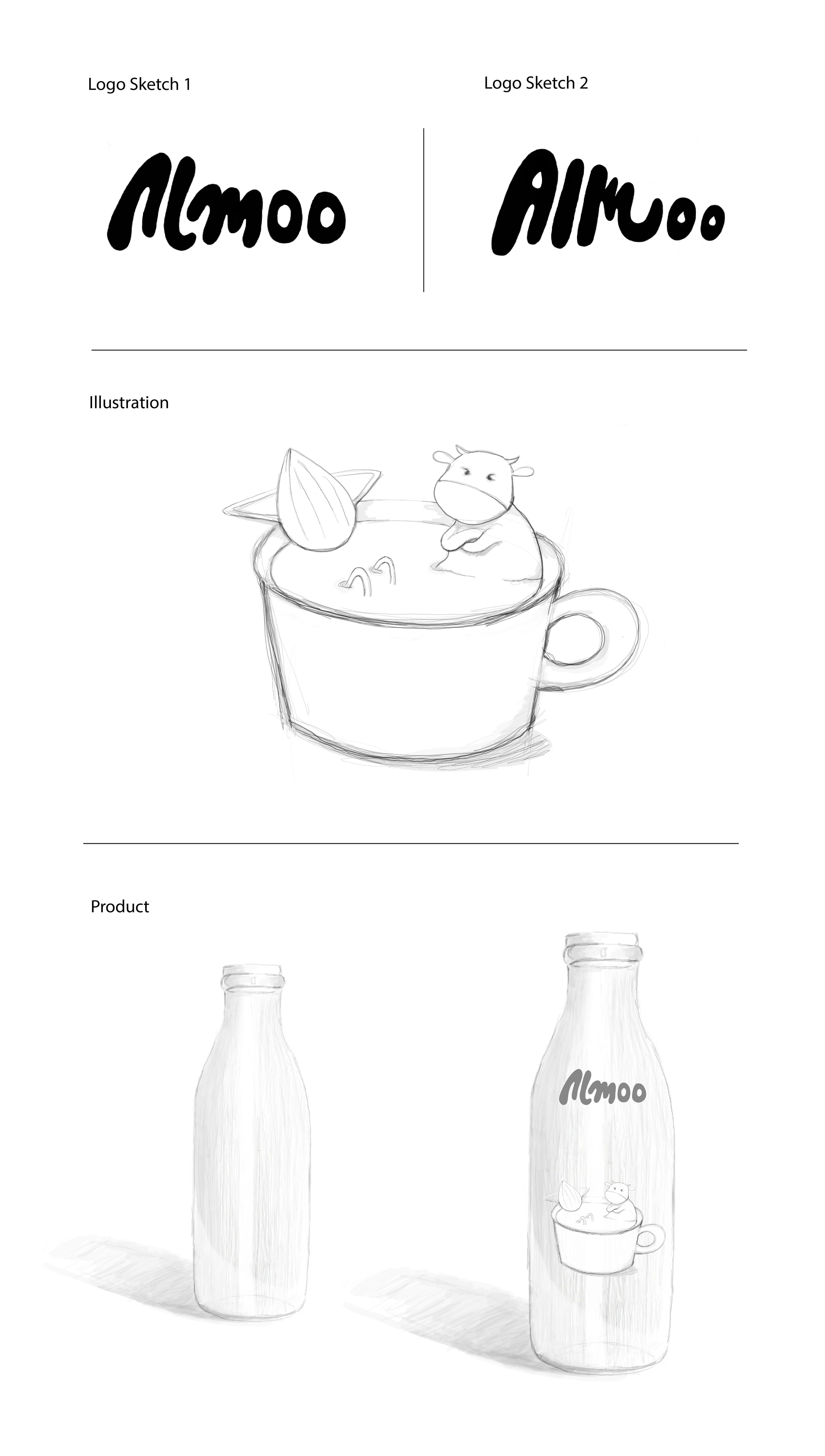
I selected logo concept 1 and three key colors—cream, brown, and blue—representing dairy and almond milk. The monochromatic illustration, with blue as an accent, evokes the oat milk vibe while making the brand feel unique. This design emphasizes sustainability and eco-friendliness while keeping the product's essence clear. The name Almoo blends "Almond" and "Moo," reflecting the playful, ironic tone of the brand. The illustration features an almond and a cow in almond milk, with the cow frustrated as the almond takes over, adding a humorous touch to the design.

Production


What I've Learned
From this project, I learned the importance of balancing creativity with brand messaging, especially in using humor and storytelling to convey a playful, unique personality. Collaborating with my team on a shared theme while still developing my individual approach taught me adaptability and deepened my collaborative skills. I also gained a deeper appreciation for the role of sustainability in design, realizing how even small choices can contribute to eco-friendly solutions. Additionally, designing specifically for glass packaging introduced me to sustainable design practices, enhancing my understanding of eco-friendly branding in a practical, impactful way.